Here is the 2nd Part of Jonathan Roberts’ battlemap series for NewbieDM.com readers. Part 1 can be found here. In the following weeks, he’ll be providing us with mapping tutorials for regional maps and world maps as well. You can visit Jonathan’s site, Fantastic Maps, to find other great examples of his work.
Last time we created the line art for our battlemap, and created a very functional map in black and white with a grid. Now if you want to stop at that and print then you certainly can.Equally, if you’re using this as your own reference and drawing out the map on a dry erase mat for your players, you don’t need to go much further. However if you have a little more time to invest then there are some nice tricks that can relatively quickly make your functional line map into a lush full colour map that will really stand out.
That’s what we’ll cover today. In the third part of the tutorial I’ll go through how to print out your maps or use them in a virtual tabletop.
The most important thing when you add colour is subtlety. It’s really easy to slap down bold colours in the different areas that make your map look like it’s been drawn in neon marker. Equally, it’s easy to let the colours and textures obscure the important features of a map. Remember that maps have to be functional more than they have to pretty. The map you have already has all the function you need, make sure you don’t lose that when you add the colour.I find that it’s best to start off with one unifying texture as a background and build up colours, highlights and shadows on top of that texture, without ever truly obscuring it. This allows the background texture to tie the whole map together giving it a unified look and feel. The texture I use most often is a parchment texture, but If I’m doing a snow and ice map I’ll use something in blues and greys.
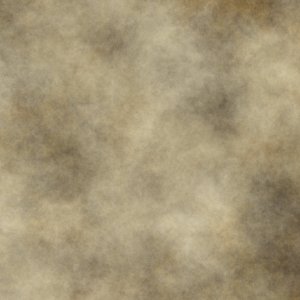
The important thing for the rest of this process is that the background around the middle of the scale in tone – neither too dark or too light. If you want to borrow the texture, here it is:
So, first things first, copy and paste the background.jpg onto your background layer. Make sure to click the anchor button on the layers dialogue to fix it on to your background layer.
Note that I’ve added a few more details to the map since the last tutorial. Now there are some lines that will delineate my lava in the main cavern, and in the dragon’s lair.
You can see that this background softens up the map a lot. Next we’ll quickly add some punch. Create a new layer and fill it with black (Edit->Fill with foreground colour, ctrl-, or just select black as the fill when you create the new layer). Now your whole map is black. Don’t worry, we’ll be bringing everything back soon enough.
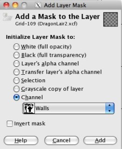
Right click your black layer in the layers dialogue and add a layer mask. Once again we want to set the mask from the channel we saved our selection to. This time we want the black to only appear in the region within our selection, so make sure that the invert checkbox is not checked this time.
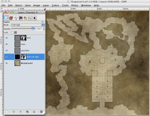
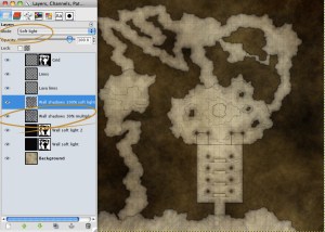
Now isn’t that a bit better? But the walls are still totally black which is not quite what I meant when I mentioned subtlety. To fix that, we must change the layer blending mode. These are very powerful settings that can do wonderful (or truly horrible!) things to an image. Here we are going to set the layers blending mode to Soft Light:
Now instead of a heavy black, the dungeon walls are a subtly darker shade with a texture consistent with the open spaces. It’s almost as if you’d stained the paper with a dark ink wash. If you think this isn’t dark enough yet (like me), you can duplicate the layer (right click layer->duplicate layer).
Now our dungeon looks pretty cool. However it would be nice to put some shadows under our walls. This has the effect of tricking the brain and making the walls look like they are above the floor. We’ll be using the same trick to break up the different elevations in the dungeon.
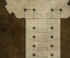
Now there are a couple of things to watch out for when doing this. Lots of people see the drop shadow filter and leap on it. Here’s an example of what you can end up with:
This is lovely and clean, but I have two problems with this approach. Firstly, the displaced shadows make the pillars and walls look like they are floating, rather than being solid objects that connect with the floor.
Secondly. the perfectly even and smooth shadows stand out like a sore thumb in contrast to the grungier parchment texture and ink like colour scheme. The human eye is very good at spotting patterns and regularities. One of the advantages of having a textured background is that it breaks a map up and avoids giving the impression that a map is computer generated.
It also means that any small human errors in your own drawing of the map add to the hand drawn feel rather than detracting from it. The drop shadow filter runs exactly contrary to that.
Instead, I prefer to do the following. It’s a little more time intensive, but I prefer the effect it creates. First create a new transparent layer above all the rest (ctrl-shift-n) and set the blend mode to soft light.
1. Right Click the layer mask on your Dark Walls layer (the one you set to soft light) and pick Mask To Selection.
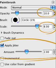
2. Now choose the paint brush from the toolbox and pick the following options:
3. Go to Edit->Stroke Selection. In the stroke selection dialogue pick stroke with paintbrush.
Now you’ll see a scattering of very light shadows along the edge of the wall. Reduce the size of the paintbrush a little and the jitter amount and repeat. By continuing this process you quickly build up a nice shadowed edge to your walls that’s irregular and broken up, in keeping with a rough dungeon.
If the circular shape of the brush you used is too obvious then you can blur the whole layer using Filter->Blur->Gaussian Blur… Now we don’t want the shadows to be on the walls as well as on the floor, so apply the same layer mask to this layer as you applied to your grid layer.
Obviously you don’t always have to use a round brush for this. Experiment with the fuzzy brushes. I also find that the Galaxy brush can work really well for a natural stone texture. If you set the colour of the brush to be white then you can put rough highlights in as well.
Here I’ve also duplicated the wall shadows layer and set the second layer to have a blend mode of multiply with an opacity of 20% which really punches up the shadows.
So we have created the illusion of depth, and of rough caverns with these shadows along the walls, but we still have large steps inside the caverns themselves, that just look like lines on paper. We need to add shadows and highlights to those too so that we clearly indicate the elevation changes. We’ll do something very similar to our wall shadows for this, the difference is that this time we can’t rely on stroke path to do the heavy lifting for us.
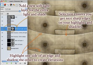
Make sure you have the Lines layer selected. Use the fuzzy select tool to select the region you want to draw within. Remember to use Select->Grow (with grow set to 2px) to make sure the selection runs along the middle of your lines. Create a new layer and set it to soft light to contain all your elevation shadows. Now rather than stroking the selection with your jittery brush, use the mouse to draw in the shadows. The more times you go over a region, the darker that shadows will be. Set the colour of your brush to white to to lay in highlights. This is how I created the tiered effect in the room leading up to the sacrificial chamber.
If you turn off the jitter and use a smaller brush you can place sharp highlights and shadows. I’ve done this around all the edges, and used the same process to define a staircase leading up to the front door. Remember that you can always build these things up gently using a low opacity brush. It takes a little patience, but the results are better than just wading in with a 100% black brush and laying down one hard stark line.
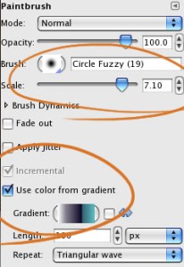
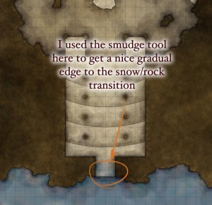
With that we’re pretty much done! I want to place some colour outside the front door to indicate a snowy landscape. In this case I hit the Use Colour from Gradient option in the brush settings and picked a grey and blue gradient that comes with Gimp. Then I painted in with a large fuzzy brush, and used the smudge tool to avoid sharp edges in the doorways.
Once again, a layer makes sure that I don’t end up with blue in my walls.
This is a bit dark for snow, so with this layer selected I used Colours->Brightness/Contrast to lighten it up (moving both sliders to the right) and set the layer to soft light once again, with a duplicate of the layer set to normal and reduced to 50% opacity. Voila! Snow and ice!
If you want to create a grassy area, just lay down some greens and browns using an appropriate gradient for your brush. For rock and stone, use a gradient with greys and browns. Once you have the colours blocked in, duplicate the layer, setting one layer to 100% soft light and the other to 50% normal and you should have a subtle colouring that suggests the kind of terrain that you want.
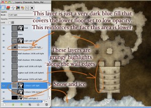
You’ll notice I’ve added a couple of extra tweaks to the map as well. I’ve created a new layer and filled my lower area in the sacrifice cavern with dark blue set to 50% opacity and soft light blend mode to make it clear that the floor is lower. I’ve also added some subtle texture to the wall edges using the galaxy brush scaled up with lots of jitter. That’s what the
“lighter wall” and “Wall grunge” layers are for. This all adds a little extra visual interest to the map and a little polish. Taking the time to add detls like that pays off in the overall appearance in the end, but they’re certainly not necessary to get a map finished for game time.
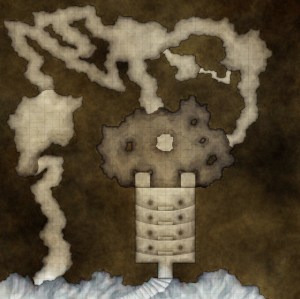
Now we have a pretty map that clearly shows the caverns and tunnels of a dragon’s lair. It’s a little bare – we could do with some doors and a rope bridge, perhaps some torches, the lava I mentioned and what would it be be without a dragon’s hoard? I’ll talk about different ways of going about this in the last installment of this tutorial, as well as discussing the means of using a map like this in your game. Until then, here’s the map so far:



Colmarr
November 11, 2009
Yet more amazing work.
I’m constantly amazed by some of the talented people to make our hobby really sing. Thanks again nDM and Jonathon.
Alric
November 12, 2009
Very nicely done, and concisely presented. Many thanks.
Jonathan Roberts
November 12, 2009
Thanks a lot. I’m glad it’s useful. Let me know if you have any questions.
bester
November 13, 2009
Thanks from Spain,
one of the most useful things i,ve ever seen on role playing blogs.Thanks both of you, Newbie and Jonathan
Gracias desde España.
Bester ; brainstormer
Kip
November 16, 2009
Wow, this is some great stuff here! I’m super keen to try it out myself.
One of my big issues with running my game is trying to provide realistic maps to help with the imersion for the PCs.
I can see this series of tutorials being a HUGE help.
Thanks again!
Jonathan Roberts
November 17, 2009
Kip and Bester, you are both very welcome. I’m glad to see this coming in handy.
Aaron Rosenberg
January 14, 2010
This is really great! I am amazed with the results of my map thanks to this awesome tutorial.
Ii101
January 27, 2010
Great tut mate, exaclty what I have been looking for. Thanks a lot!
Keep up the good work.
Cheers
Thad
August 1, 2010
I’m getting hung up on the shadow layer bit… I seem to be missing something.
I can’t figure out where (or how) you created the “wall shadows” layer.
I’ve done exactly what you said a few times, and all I get is a lightening around the outside of the walls rather than a darkening inside them.
I’ve tried inverting the selection, creating a new layer and applying a mask to the channel, the same with an inverted mask, etc… I can’t seem to get the results you did.
Any thoughts?
Raddu
January 28, 2011
Thad, make sure your path brush is set to outside or inside depending on what you’re doing..also the size of the brush/opacity makes a different.